Accessibility to creative spaces
SUMMARY
Mobile prototype that aims to provide productivity tools and resource accessibility to entry-level crafters
PROBLEM STATEMENT
Entry-level crafters struggle to discover beginner-friendly studios and documenting their progress. Their efforts in sourcing for studio sessions and documenting personal progress are fragmented in various platforms. This dispersed system makes it harder to build consistent creative habits.
SUPPLEMENTAL
ROLE(S)
Design
CONTEXT
Personal Project
TIMELINE
Sept 24' - Dec 24'
PLATFORMS
Mobile, Prototype
TEAM
Zander Vilaysane
PROCESS
( 1 ) User Research
Deployed survey to domains with crafters with questions framed around impressions on accessibility to studio spaces (affordability, skill-level, time durations, etc.)
Conducted in-depth contextual inquiry (unobtrusive observation) with a clothing designer (hobby-level). Followed him throughout his process of sourcing materials/equipment (FB Marketplace), ideating on creation, and execution of product.
Explored various studio websites to determine shared details and consistency of accessible sessions.
( 2 ) Insights
Survey suggests most users make personal task goals and source online tutorials prior to starting a craft session. They are likely to take photos throughout a session to track progress, as they also measure their progress via quality of craft result.
Contextual inquiry suggests at-home crafters value practicality in notes/documentation tools as well as photo progress. It also informs that larger investments (like equipment) encourages greater craft commitment.
Exploration on studio sites reveals consistent details of contact (phone #), price/rates, materials provided. Many studios require reservation via phone call or use of their third-party reservation tool.
( 3 ) Solution
Proposed 'Find Nearby' map feature to find local studios. Branching from this also proposed studio review system to build trust and credibility with beginners entering new spaces.
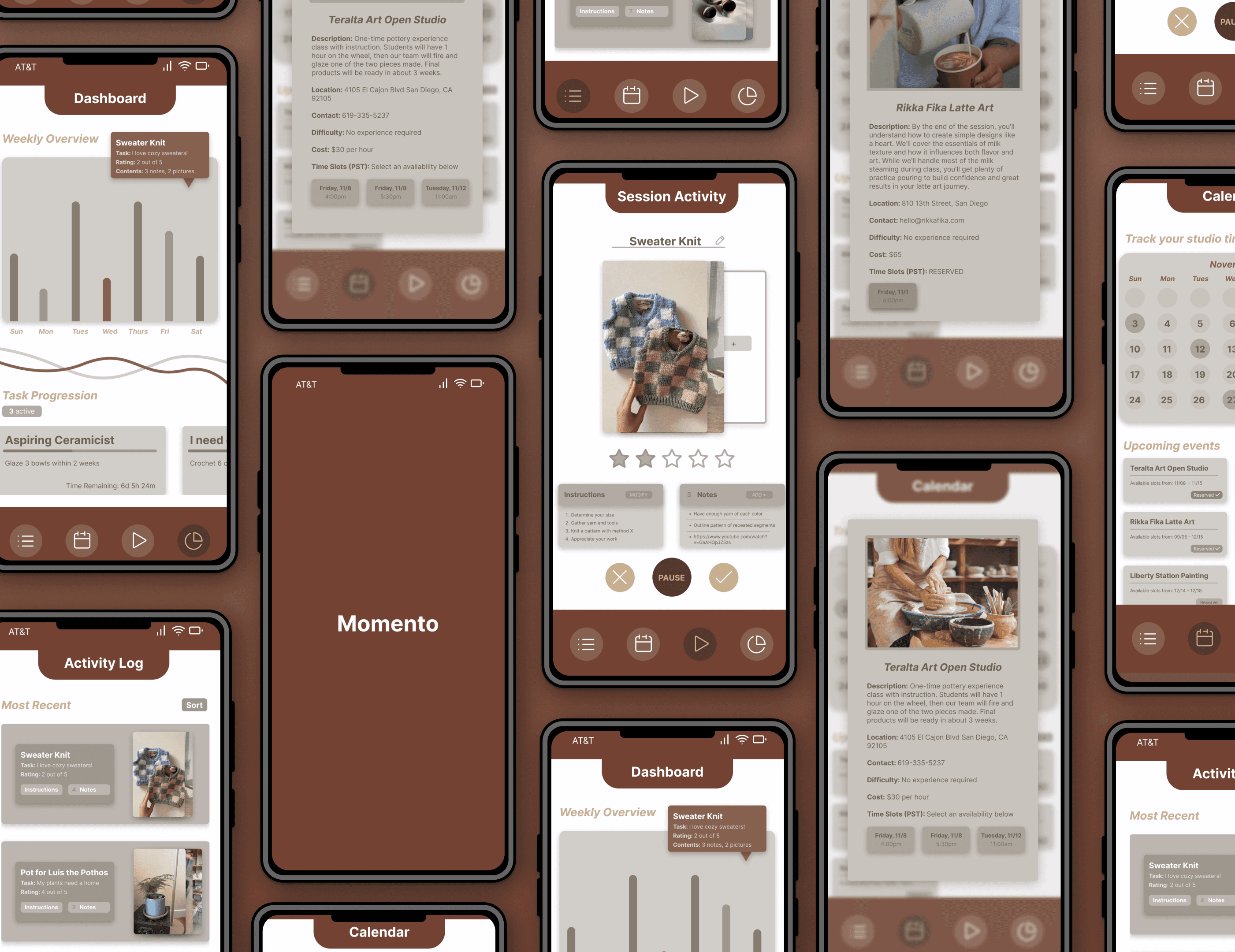
Activity Log screen for users to reflect back on past instructions, notes, and visuals they used on a certain craft occasion.
Activity Session screen where users can import links to tutorials, paste instructions or reminder notes. Hero component is a photo stack that users can add to quickly and briefly.
( 4 ) Testing & Iteration
Map and studio review skewed too far from main feature, confusing users on what main purpose of app was.
Users felt studio information card had gaps in accessibility. Didn't provide enough automation where reservation flow required too much work.
Session activity screen felt too repetitive in UI display (not enough to feel inspired/fulfilling).
OUTCOME
Replaced map feature with a calendar view showing upcoming sessions, aligning closer to documentation service.
Added reservation buttons to calendar screen -> studio cards that users can select to automatically store in their calendar.
To increase personalization on session activity screen, expanded instructions and notes widgets to display preview of steps/details.
ENDING REMARKS
Research Guides Significantly in Design Solutions
Diversifying my research approach via surveys, open web searching, and in-depth contextual inquiries allowed me to gain a strong, confident understanding in what users I am providing to. Learning by observation and empathy builds intuitive thought in a domain that I didn't have knowledge in prior.
Look at Potential Features Closely and From Far Away
Being indulged in the exploration of a singular feature will always progress the iterations of that single feature. However, failing to lookback at how it serves the user and their journey along the main process may be wasteful in time and resources.
Color Theory Matters
Initially, I had approached the mockups with 'Atlantic Tones' (Ocean Blues, Rocky Browns) per my usual branding. However, much feedback indicated it felt like a medical application. I backtracked and reflected on how 'crafts' can be reflected by color in a broad, ambiguous term, given that many different crafts can take place. This guided me towards a 'Terracotta' (Brownish-Red, Rocky Browns) palette.
visual artifacts
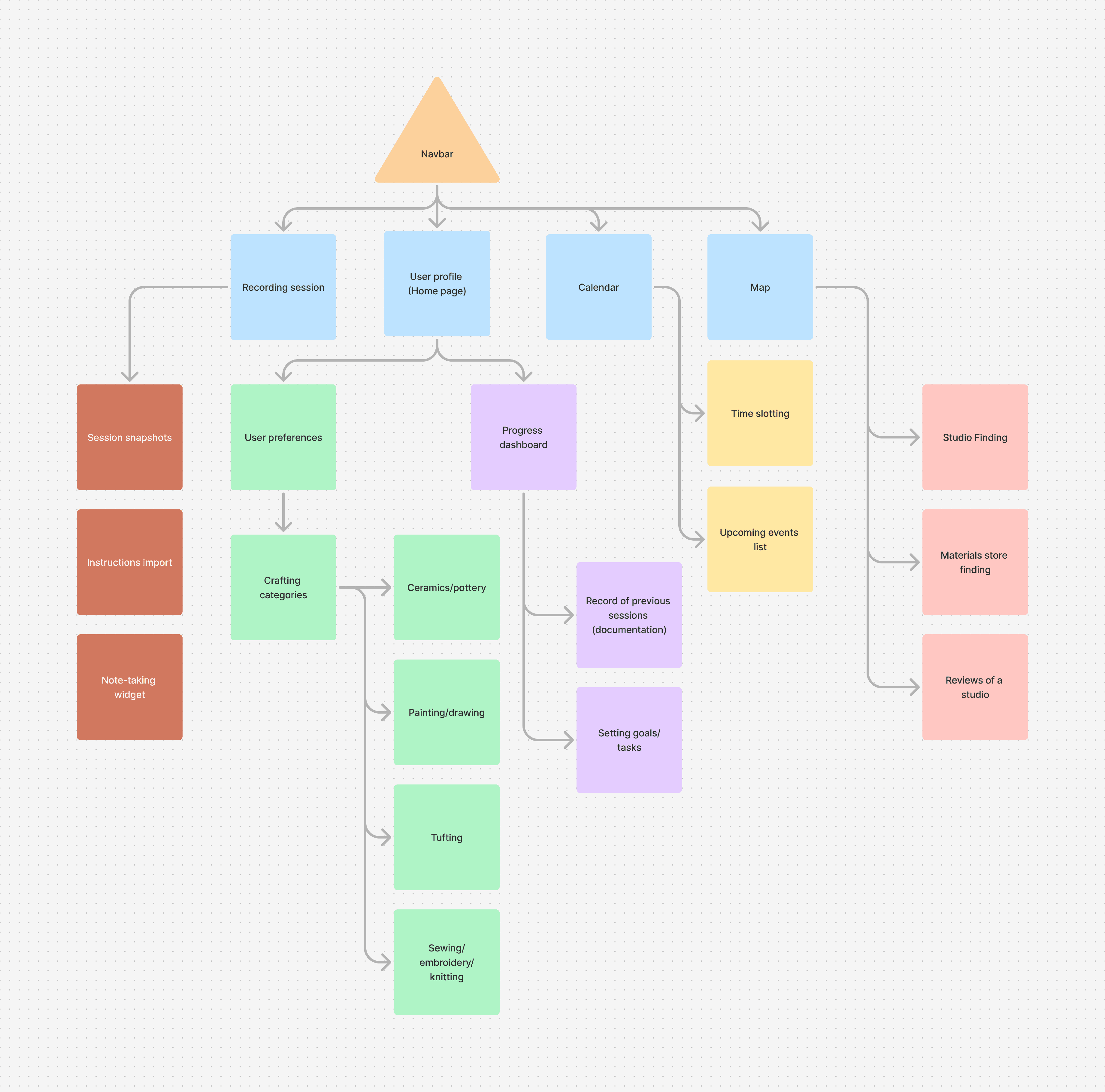
Info Architecture Diagram
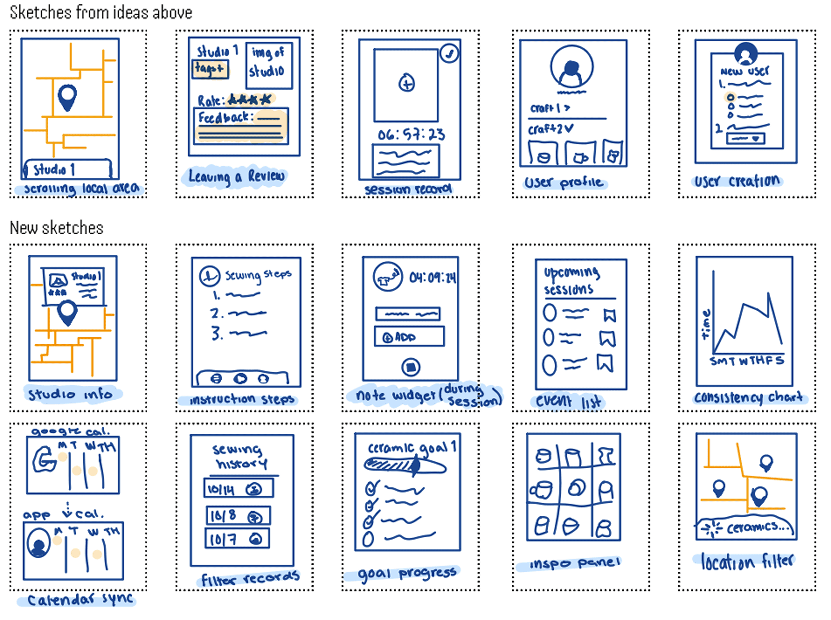
Sketches

Low-Mid Fidelities

Hi Fidelities